Tuesday, 10 December 2013

Game Engines

So, what is a game engine? My understanding of a game engine is that it is the place where all the elements come together to create a playable game. The main thing I use them for is to create a playable level to showcase assets I have been working on. Things like 3d assets, textures, terrain, sounds, AI and other scripts come together in one place to create a final product.
There are many different engines to choose from so it is important to choose correctly as things like lighting and shaders are dependent upon your choice.
The amount of different effects and elements you can achieve also depend on the engines features.

So, most engines are based on licencing and again prices can vary depending on which you are looking at. So some companies choose to create an ‘in-house’ engine; ‘In-house’ engines can be a very viable option as it gives the developer the freedom to have any features that are necessary for their game. If they have the time, money, staff and patience to create one (and make it usable for more than one title) it can be very effective in the long run as they will avoid licencing and royalty fees.
While some developers may opt for ‘in-house’ engine, a lot of companies will still choose the licencing as it may often work out easier and cheaper. The benefit of using well established engines means that the bugs have already been fixed and there are often lots of tutorials available. While some engines can limit the visuals or features of a game, more commonly used engines like Unreal Development Kit (UDK) is known to have adaptable styles. While UDK is relatively easy to use and offers great features especially for first person shooters, it may prove a challenge for other types of game (not unachievable, but more of a challenge.)


All  above created using UDK (Bioshock Infinite, Dishonored, Mass Effect 2)
So, UDK still one of the most used engines boasts a variety of different titles and different visual styles, it is popular because of its flexibility and versatility. Because it is so widely used there are plenty of online resources to help with achieving a variety of different features and styles.
Another reason it is so popular is because of its node-based shader system, the layout is somewhat similar to other texture and shader compilers and is easy to grasp.
The lighting in UDK is not real time and is baked onto a lighting map. While this does not limit the lighting effects you can achieve, plus it is a lot cheaper than real time lighting, but it does take up extra time making sure all the lighting maps are correct.


All above created in CryEngine (Crysis 3, Far Cry, Ryse)
Another popular engine is CryEngine which was originally developed as a tech demo for Nvidia, which after its potential was realised was made into a full game engine. Crytek are re-known for creating beautiful games with ground breaking graphics and their Engine sure doesn't disappoint. The real time lighting is stunning and it has an easy to use flow graph system for shaders and in-game events. While it is relatively easy to jump into (with a bit of prior knowledge of other engines) it still requires a bit of adjusting to get used to importing assets. It makes it easy to create levels that look pretty good and as an artist it is pretty simple to get triggered events and other effects working without having much knowledge of programming.
However, CryEngine is not nearly as flexible as other engines and the lighting is set up for photo realistic styles. So trying to create a more stylised or cartoon-y effect can be a challenge. Also, because of the lighting it is often easy to distinguish when a level has been created using CryEngine.


All of the above created in Unity Engine (Guns of Icarus, Kerbal Space Program, Anna)
Although I do not know much about this engine, I feel it is worth a mention; Unity. Unity has long since been regarded as an engine for hobbyists and amateurs, but since its development it has drawn the attention of many companies. It’s vast tools for mobile games and has a pretty cheap licencing fee have helped build its popularity. It is easy to access and is surprisingly versatile with plenty of shaders and tools available. Unity is also well rated as it works for browsers; the Unity web-layer enables Unity levels to be accessible via internet browsers, as well as created and played over the internet with hardly any download necessary. Another important thing to look at is the fact that it imports max and maya files which helps speed up the work flow.
However as it is still being improved the lighting is not amazing, especially when competing with CryEngine and UDK; but there are plenty of plug-ins available from companies like Marmoset, which help improve this tenfold.
Obviously there are lots of other exciting game engines out there; these are just the three I am most accustomed to. It is worth researching other engines as they can offer even more different features and effects that would be more suited for whatever project it is you are working on. It is always worth looking out for new engines as well as the market is constantly changing so new programs will be developed to suit its needs.

Monday, 9 December 2013

Mock up on Documentation

My mock up practice brief;

My project will be a 3rd person Fantasy RPG game where it is driven by narrative and quests, there will be lots of vast environments to explore. I will write a project outline for one area in the game. I want the level to be immersive and have lots of exploration elements. All concept work with be produced at the beginning.
It will be specified for PC and consoles and will be created in Unreal Engine as I am most familiar with it. The audience is ages 15 upwards and will have a realistic style. The other programs I will be using are 3D Studio Max, Photoshop, Crazy Bump, World Machine and Zbrush.

There will be;

  • ·        A lead character

o   The lead character will be either a male or female generic hero type character. The player can chose between dual wielding weapons, bow and arrows, mage’s staff or stealthy daggers.

o   Character no more than 30 000 tris
o   2 x 1024 x 1024 (diffuse + alpha) 32Bit
o   2 x 1024 x 1024 (specular + gloss) 32Bit
o   2 x 1024 x 1024 (normal) 24Bit

o   Weapons no more than 5000 tris
o   2 x 512 x 512 (diffuse + alpha) 32Bit
o   2 x 512 x 512 (specular + gloss) 32Bit
o   2 x 512 x 512 (normal) 24Bit

  • ·        An NPC

o   The NPC will be one of the enemies. As the player traverses the environment they will encounter many different enemies. The NPC I will create will be the basic ‘undead soldier’ character, who will be one of the most common enemies.

o   Character and weapons no more than 10 000 tris
o   1 x 1024 x 1024 (diffuse + alpha) 32 bit
o   1 x 1024 x 1024 (specular + gloss) 32 bit
o   1 x 1024 x 1024 (normal) 24 bit
o   Should include 3 LOD’s

  • ·        A vehicle

o   The vehicle used will be a small row boat that can be used to traverse over lakes and rivers in the environments.

o   No more than 5000 tris
o   1 x 1024 x 1024 (diffuse + alpha) 32 bit
o   1 x 1024 x 1024 (specular + gloss) 32 bit
o   1 x 1024 x 1024 (normal) 24 bit
o   Should include 3 LOD’s

  • ·        An environment

o   The level will be a castle ruins in a forest by a lake, where the aim in to make it to the ruins as an ancient relic you player requires is hidden within.

o   Will consist of terrain and skybox
o   Including heightmap
o   4 x 1024 x 1024 (diffuse + alpha) 32 bit
o   4 x 1024 x 1024 (specular + gloss) 32 bit
o   4 x 1024 x 1024 (normal) 24 bit

  • ·        Prop or scenery objects

o   Most of the props will be foliage and other plant life; so trees, shrubs, grasses, bushes, rocks, dirt, etc. There will also be the ruined castle which where possible will be modular, with more unique assets like statues and gargoyles.

o   All props minor props should be under 1000 tris and hero assets can go up to 5000 tris
o   Should all include 3 LOD’s
o   Each minor asset can have;
o   1 x 512 x 512 (diffuse + alpha) 32 bit
o   1 x 512 x 512 (specular + gloss) 32 bit
o   1 x 512 x 512 (normal) 24 bit

o   Each hero asset can have;
o   1 x 1024 x 1024 (diffuse + alpha) 32 bit
o   1 x 1024 x 1024 (specular + gloss) 32 bit
o   1 x 1024 x 1024 (normal) 24 bit


My personal aims for this project will be to develop my organisational skills, my understanding of UDK, my understanding of budgets, my understanding of artistic direction, creating a set of assets that harmonise to create a visually pleasing level, to practice using lighting well and also to help me understand good level design, so that the environment is easily traversed with a clear goal, while also encouraging exploration. 

Friday, 22 November 2013

Level Design

Level design, would seem somewhat different to the kind of things I would usually think about when designing something. Level design is driven by player interaction, and from my research I would say it seems to be about a harmony between game mechanics and visual design. I would also argue it is also about telling a story without using words or dialog.
I read an article (by Dan Taylor on Gamasutra) on key principles to good game level design; the main points seem to be that player interaction is what keeps the player engaged. While I strongly agree that the interaction with the game is what helps drive the narrative along, I want to discuss the importance of visual design in a level and how it strongly aids the interactions in a game (as this is what is more relevant to me.)
While key triggers and events keep the gamer excited and engaged, I feel that it requires visual cues to draw the player through the level and create a sense of flow.

One of the first points made is;
‘In most cases, the player’s core method of interaction with your level will be navigation – the process of actually traversing the level.  Careful layout, lighting, signage and other visual cues should create a natural “flow” to the level that guides the player instinctively through it.  From an aesthetic aspect, a game’s levels should all work together to create a consistent visual language, through the use of colour and form, that the player can learn, to progress intuitively through the level ‘


So after the level and interactive elements have been blocked out then the visual work must support this set up by leading the player to where they need to be and without being too obvious. It is important to still leave the player with a bit of autonomy, it would make sense to still have areas hidden from the player as to make levels replayable and encourage the player to explore and be rewarded for that. Again it would seem that it is all dependent on what type of game it is as to what level of exploration verses obvious direction there is. 
The main ways of trying to lead the player with design would be with lighting, signage and clear direction. Interestingly, I would argue that this relates very well back to the visual composition I was discussing in a past post; the way a scene is composed can strongly effect where the players interest is drawn. Trying to think about it as what is the first thing the player would see, and how will we get them to look over to where the entrance to the next area is. Similar elements like high contrast areas, arabesques and coincidences can get the player headed in the right direction.


I feel that thinking about level design in this way may help to improve upon the interactive elements in a playable level. If those elements are pivotal to the progression of narrative, then we need to visual cues to get the played to the right area at the right time.  Visuals are very important to level design.

Monday, 11 November 2013

Visual Composition

Visual composition was never really something I properly thought about in my past work. My uninformed approach is normally to just go with what looks right by instinct and just settle with that.
Yet after being introduced to composition techniques in my visual design classes, my mind has well and truly been blown. I have had a glimpse into the importance of design, to think smart when creating an image, and to look further than simply the rule of thirds.  To be honest overall this year has been a mind changing roller coaster so far.

So, what did I discover? Well, there is a reason that masters work is so timeless, they were using incredibly clever and structured techniques to create an image that does exactly what the artist wants it to do. They understand what draws a person to an image, where do they look first and why? Once they understood this they started using set formula that means they can make the viewer see what they want them to. This is only in regard to visual composition, not even touching the other areas they had outstanding understanding of. 


I have also been reading a blog (http://www.ipoxstudios.com/canon-of-design/) in which these techniques are much better explained. I have only just started to get my head around it and I still have a lot to learn, I’ve had a glimpse but the stuff these guys were doing was so vast.  The author has been doing daily posts regarding different areas and explaining a lot of it so that I may start to understand what they were doing. I am hoping just having a basic understanding and trying to incorporate it in my own work will help me improve. 

It is odd to think, but what exactly have I been doing in my art education up to this point? It continues to baffle me how after 7 years of art education they failed to even properly mention basic drawing techniques. No wonder society thinks we just sit around drawing pretty pictures all day.

I really enjoy the blog posts where the author take the time to sit and break down some masters paintings; showing some of the thing they were doing. The link above is an analysed painting by William Adolphe Bouguereau and it is nicely broken down into the different elements used. 

Study and composition analysis by Miles Johnstone


My own analysis and study of 'Miss Elsie Palmer by John Singer Sergeant'

Saturday, 2 November 2013

Planning and Concepting


Planning and concepting are two extremely vital parts of any project. A very misconceived opinion I seem to have noticed floating around is; 'I know how to do 3D, so I don't need 2D.' Obviously this is a load of rubbish. Your 3D work is going to benefit and improve tenfold if it has started with decent planning and decent concepts. One of the main focus'/realizations I have had this year is that having a good foundation in your 2D skills is more helpful that just being a wiz at 3D modelling. Developing an understanding of form, composition, and other basic drawing skills takes a long time. The more confident you are with it the better as it is easily transferred to your 3D work. Where as learning the 3D sides is often simply a case of looking it up on the internet.


In regards to concept art, there seems to be a massive misconception as to what it is. If you look up concept art you will usually find, beautifully polished and rendered pieces of work with a strong, well established visual style. So there is a general census that this is what concept art is right?
Well, another of my realizations this year is that actually no, what we are fed by the media as 'concept art' is not that at all. The stuff we are fed would be better named as 'promo art.'

Wikipedia says: 

'Concept art is a form of illustration where the main goal is to convey a visual representation of a design, idea and/or mood for use in films, video games, animation, or comic books before it is put into the final product.'

This gives a better explanation of what it is; while this is the general description of what it is, concepting is a lot longer and more thoughtful process than that. There is a tonne of work that goes through a process of developing thumbnails, variations or iterations of ideas before getting close to the final designs; most of it is scrapped or vastly changed. 
But this is vital to the process, it is extremely important to be critical and to be clever throughout the design process. It is not just simply drawing pretty pictures all day; it is an intelligent process where the concept artist is creating these images with a very specific purpose and idea in mind.

The fact that the public idea of concept art is warped is mainly becuase of the stuff that is relaeased as concept art. While this has a negative impact on students and amateurs who want to pursue a career in concept art; creating unrealistically high standards for them and restricting them from the real techniques that concept artists use, it is understandable why this has happened.

A company is not going to want to release concept art throughout the design process;

'Companies only release concept art when it is polished and final enough to represent the actual product. Nobody wants a design go viral, which is possibly later rejected and have customers imprint a wrong visual key.' - How not to suck at game design (explains topic very nciely.)

Planning and concepting needs to be treated as a vital part of the design process. It should be done in an intelligent and reflective fashion; seeking as much feedback and criticism as you go. This will push oneself further and nail the key visuals before processing to a more finalized product. It also should not end at the beginning, being prepared to go back and develop more is also important. For example, doing paint overs of an existing level or character is going to help move the idea further. Planning and concepting ensures that the project will run smoother but also is a constant through the whole design process.

I found a thing.


Friday, 4 October 2013

I'm Back....

Soooo, back to Leicester! I'm glad to be back! I mean I love being at home, I love seeing my family and friends, but I've been struggling without some sort of routine. This summer has consisted mainly of me hesitating to leave Leicester (I stayed in my halls until the 22nd of July, due to work), going on holiday for two weeks, then having a month at home where I felt somewhat at a loose end as to what to do with myself.

I had planned to do a bit of a mini group project with a few of my class mates. Before leaving to go home we had decided our project, put together some mood boards, started concepting and white boxing a little tavern scene. Somehow, although I am not surprised at myself, nothing much really came of it. I did some concepts but I never really got much further past that stage. I feel a bit bad for not chasing it up, but on the other hand I found myself getting quite a lot into my digital painting. While I was in Spain for those two weeks, I found myself dying to do some work, whether that was modelling or painting. I put the main reasoning down to the fact that the place I was staying was so beautiful.

Some Summer work....


We stayed in a little village called Frigiliana. It is situated in the hills and the buildings have red tile roofs and white bricks, the pavements are all cobbled in swirly patterns, very idealistic. But, another factor is that when I go on holiday with my parents they don’t like to do much apart from sit around the garden area and read books all day. This is all well and good and I appreciate relaxing for a short amount of time, but when it was getting on the 6 day mark and we were doing exactly the same thing that the days started dragging. As I mentioned before one of the main thing I established last year was that I am pretty crap at doing nothing, after being used to the constant list of things I need to do for uni, having absolutely nothing to do was an alien concept to me.


Me, Ben and Anna all got back right at the beginning of September so, after moving into our new houses (which are super awesome) we were excited to get back to the uni timetable and start doing some work.
This year I am super excited to start the character project and the group project. I think I am looking forward to being given a little more freedom on our briefs, with us having larger budgets and more artistic choices. I am mainly hoping to improve on my speed of work and managed to get more personal projects in on the side.
I have come to the realisation that the amount of work we do for the course, isn't even close to the amount we need to be doing if we realistically want a job when we graduate.  Also this is the year that we will be applying for internships, so it is very important to start putting a portfolio together as we will need them to apply.

I am excited about this year, but also very very scared. I kind of feel like I can see the scale of things a little clearer now, and that mountain I thought I had climbed last year was merely a small hill.

Saturday, 25 May 2013

Year 1 Review...


This year has gone stupidly fast. It does not feel like we’ve been here for a whole academic year already, not to mention our course is somewhat longer than everybody else’s. I mean, we had weeks left before hand in and my flat mates had already started moving out. I’m not ready for this year to end. I need more stuff to do, this year one of my main discoveries is that I’m terrible at doing nothing.

In fact, a lot has changed this year. If you met me this time a year ago, I would have been a very different person. I defiantly had a bad attitude to my work.  I will admit, at A level I definitely could have tried a hell of a lot harder.  I complain about the low mark I got, but looking back, I’m not surprised.  Since getting here I have found something that I actually care about, I’m being challenged, I can actually see myself improving, and it’s completely refreshing. I think my main issue with my A levels was that I had been doing exactly the same thing for the last 4-5 years. I never really left my comfort zone. I studied two art subjects, media studies and philosophy. To be honest I found philosophy the best as I was learning something new.

I mean it wasn’t until the last minute I decided to take the risk and go for this course I was intending on keeping on with the illustration and fine art path. I am so happy I decided against it. If I was doing illustration or fine art right now I don’t think I would have improved much. I certainly would have the same attitude towards it and right now I would probably be over the moon that I had finished.
The difference is; I chose game art. I am currently devastated that I have finished and I want more work to do. My routine has drastically changed this year, I was always accused of being lazy, lying in for ages, but simply I didn’t have something I wanted to get up for. I have become so much more self-motivated.  I’m now up bright and early every day and working until late, because I’m doing something that I love!  
So, how have I improved, and where the most. I guess for the majority of people on the course 3D is going to be where the most improvement lies. I mean, we arrive here all mostly all complete noobs, never having encountered 3D modelling before, and then are chucked straight in with no knowledge on the subject what so ever.

Well lets look back, where is my most atrocious 3D modelling crime to date?
Well this bin is somewhat shameful. I mean the render is hilarious for a start, although not as bad as some of my others with wonderful multi-coloured backgrounds. It wasn’t until after chatting to some third years that I got to grips with doing a decent render.  Looking back at the topology, well, blimey, I was still at that stage where I hadn’t understood that it was ok to have more than one object attached together, as opposed to having one single object.  Ngons galore! I guess as it was one of our very first projects it isn’t completely shameful as we were (and still are) on that huge learning curve.  

A project I was particularly proud of and feel shows a lot of development in my skill, was when we got to the Gladiator project. This was only the term after the wheelie bin, but I already felt much more comfortable with modelling. I had a good understanding of topology, I had moved on to more advanced processes like baking ambient occulsions, zsculpting and baking normal. Not to mention my renders improved drastically.  
When I started the course I didn’t think I would ever be able to make something like this.


I have also been working on my zsculpting, which has helped me practice my anatomy and technical skills in baking in max.  (High poly vs. Low poly bake)

For visual design I feel that I learnt the most in the first term. It was very helpful going back to basics and mastering them,  it has certainly helped me improve overall. I terms of my traditional work I have improved a decent amount, but in my digital work, I feel I have improved rather a lot.


Well this is the first piece of digital work I attempted before coming here in September…


I mean wow, like wow, what?? What is this?? This is true chamber of horrors material, please forgive me Mike. I swear I could at least draw the human figure better, changing from traditional media to digital is somewhat challenging. I think the idea was to learn to achieve tone; obviously this didn’t work so well.


Here are some of my recent pieces...


I feel that I have improved vastly. Life drawing has seriously helped me with my human anatomy, and doing the masters study and other exercises with Chris has helped me to get a better grasp of colour theory.

I have really enjoyed all aspects of the course so far, I’m very pleased that I decided to come here.  My main downfall has unfortunately been this blog. I’m a person that really struggles to get words down. Ask me about stuff in person and I can talk about things for ages. I have also never been someone to get into the habit of regularly writing diaries. My main aim for next year and summer is to get into the habit of this, start writing more about what I’m doing, what I think about it and more often. 
I will be better at blogging, I will be better at blogging, I will be better at blogging... 
I even considered doing video blogs as I am a much more confident speaker, especially after all the presentations we have done this year.  They have seriously boosted my confidence in talking in front of people about subjects that effect, are important or interest me.  I saw a drastic improvement from my first presentation to the final one (my mark also reflected this.)

Over all I feel I have had one of the most successful years in my academic career, I have learnt so much and my attitude to my work has changed drastically. I feel a lot more confident with what I want to do in life and how to go about achieving it. I love my course and all the amazing people I have met here.

Also, Adventure Time rules.

Friday, 8 March 2013

Game Design Part 3 - Characters


The next element of game design I will discuss is Character design. For me Characters are one of the most important elements of games, certainly my favourite part in terms of design. The characters help to make the narrative move and create depth in the story.
It’s easy to answer, ‘what is character design?’ a more relevant question would be ‘what is GOOD character design?’
More and more game developers are realising that just having an aesthetically pleasing character is not enough to keep a gamers interest, the main aspect that makes a good character is depth, little elements to their design and narrative that make the gamer develop a personal relationship to the character.
It is important to look at characters in other media like film and TV. How do they construct a interesting character that the audience can relate to. There are many examples, as film and TV concentrates so much more on the back story and look (to an extent) of a character, which seems to be more and more the case in games.


Let’s take the character Joffrey Baratheon from the book and TV series Game of Thrones, his whole persona makes you instantly dislike him (well watching the series, this was the case for me.) I think that this is accomplished by his looks and acts through the series. Firstly his clothing is dark and with rich colours which connote that he is from a rich family. His sharp features make him seem cruel and the way the crown doesn’t sit properly on his head makes him seem out of place as king. Conventionally a king is big and strong, not small and weedy like Joffrey’s character which all the more just adds to the fact that he must be a cruel and sinister character. As the series progresses his acts and characteristics show his character all the more and reveal his back story, maybe offering an explanation to his cruel deeds. This makes the audience feel like they understand him more and maybe connect with him.
Although this character is a ‘bad guy’ it is still an example of good character design, the look and person of him adds strength and depth to him.

How is this now more often applied in games?


Dragon Age Origins bases a lot of the gameplay on developing character relationships and focus’ a lot of narrative. The character Morrigan is one of the first companions you gain in the game, she is so likeable because of her personality. Again similarly to how the character is set up in Game of Thrones her character is established with her looks and how she acts in game.
I love to see that games are having to act and think like a film director, considering how the story will affect the characters and how the characters develop through the game and make the audience feel involved and relate to the characters around them.
It is important for the characters to have depth, as the games move on, what is now getting more popular in games is how immersive it is and how much the gamer feels involved and develops relationships with the characters.

Friday, 22 February 2013

Game Design Part 2 - Art Direction


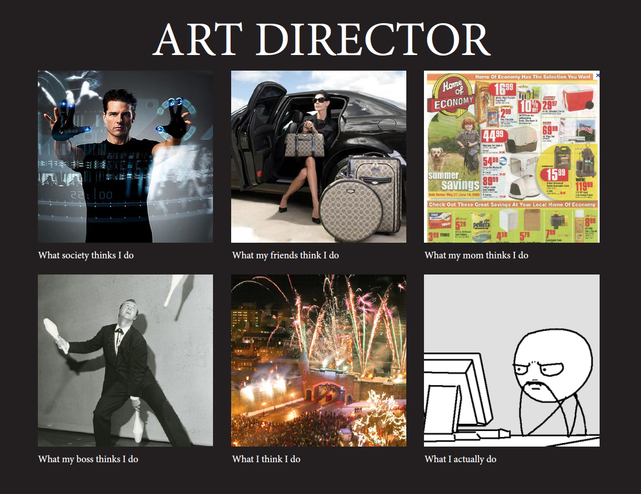
Art direction, who is in charge of this very important part of game design? The Art director of course. What does he/she do? Well they are in charge of setting the look and feel of the game aesthetics. They must make sure that the style and feel stays consistent through all the aspects of the game.  The Art director acts as the glue keeping all the different parts of the team together, maintaining good communication and solving problems.


The art directors job starts way before the game is even started to come to reality. They must plan the main feel and aesthetics of the game with core developers and a small art team. They create the main concepting and allow time for the main style to be explored and edited. 
Their role involves a super human amount of organisation and management. Time keeping is key, trying to plan the timing of the creating of every asset in the game takes a lot of good organisation. Making sure that each part gets handed from the modellers, to the texture artists to the animators and then into game require perfect communication, all of this is accomplished by the art director.
Providing feedback is also an essential, the director must be able to look at aspects of the game give their feedback but also keep moral up. Pointing out what’s good as well as suggesting a way to improve is a key skill, usually easier said than done. Getting a healthy balance between productiveness, respect and constructive criticism is key.


It goes without saying that the art director must be an artist their self (they wouldn't be there without that) as well as having good management skills. They must have a good understanding of how colour, shape, form etc. affect the look and feel in a game. They, after all, set the initial style of the art in the game.


One would presume that the role of art director was relatively similar between different creative industries. For example in the film industry the art director would bring all the departments together, keep the style the same across all boards, etc. in the same way as they would in the games industry. 
Based on an art directors duties, if one wanted to become an art director they would need to focus on their management skills. Management and time keeping are very important but I think the core skill should still be based on their creativeness. It makes sense as the art director sets the main style, feel and aesthetics of the game so they must have a good understanding of design. This also helps when they must review work by others in the team, you must have an understanding of something to give valuable and constructive feedback. 

Monday, 18 February 2013

Game Design Part 1


So, what is game design? The process of making a game, right? Well to put it simply, yes. But a better way to look at it would be that game design is the consideration of what the game is aiming to achieve, a judge of it would be how well it accomplishes this.
Obviously a game isn’t one person’s work, there is a large team of people working on one title. But with so many people, and so many different design ideas, how to they keep to one set design? Well this is where the lead designer comes in. This person sits at the top of the design hierarchy and tries to create some order out of the chaos. They have the most say in the artistic direction and the general design in the game. 
The rest of the team is organised into three parts; The Systems Designers, Level Designers and the Writers.
Each group is responsible for different aspects of the game. The system designers make sure that the game plays correctly, that all the mechanics are balanced correctly, for example they ensure that the power of weapons is equal and fair. The Level Designers were in charge of creating the levels and making them aesthetically pleasing but also playable. Finally the Writers who create the story line and narrative helping the players immerse and create the escapism in game.

So these guys are responsible for the design, but surely there is more to it than just this. Well in the beginning of the 21st century three people made an attempt to theorise Game Design. Robin Hunicke, Mark LeBlanc and Robert Zubeck wrote a paper called ‘Mechanics, Dynamics and Aesthetics’ (MDA.) They categorized Game Design into these key three groups. Mechanics referring to the technical stuff the governs how the game plays, the Dynamics are the experience and feeling gained from playing these mechanics and finally the Aesthetics look and the reason we choose to play said games.
It is important to highlight that when it comes to game designers they will start at one end of the spectrum, looking first at mechanics, then the dynamics and finally the aesthetics so sometimes the importance of the aesthetics can be lost and the main concentration may go on the earlier parts, which can make or break a game. This effect the games success as a gamer will look at the opposite end, the aesthetics draw them in then the dynamics of the game make the experience better and the mechanics make it run smoothly. So it is important to get the aesthetics right as that is most important to the gamer.

The MDA goes on to try to define genre’s in a different way to today’s common genres like ‘platformer’, ‘first person shooter’ ,etc. as these genre conventions are often broken. For example games often don’t fit into one genre, take Portal, which following conventions is a first person shooter, but the main appeal is the fact that it is a puzzle game.
So the MDA separates it into eight new categories.
Sensation, Fantasy, Narrative, Challenge, Fellowship, Discovery, Self-Expression and Submission.
As opposed to defining a game as what it is, it attempts to take the appeal and reason for playing a game as a way of categorising them.

I will give some quick examples;

Sensation – Sense pleasure

Fantasy – Escaping the real world

Narrative – Game as drama

Challenge – The obstacle course

Fellowship – Comradeship

Discovery – Fantastic new worlds

Self-Expression – Be yourself

Submission – Switching off